










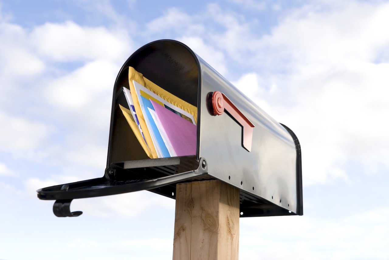
Every day, your prospects sort through a pile of mail while standing over the recycling bin. In those few seconds, your piece either earns a second look or lands in the trash. Bold design is what tips that decision in your favor. The best campaigns pair sharp creative with expert mailing and printing services to turn a crowded mailbox into a real opportunity. Below are six actionable design strategies that help your mail command attention and drive a response.
Lead With Color That Demands Attention
Color is the first thing anyone notices, often before they read a single word. In a stack of white envelopes and beige flyers, a saturated, unexpected hue instantly breaks the pattern.
Choose colors that match your brand but push the boundaries. A deep navy envelope, a burst of coral, or a metallic accent can pull the eye across the room. Just keep contrast high so your message stays readable. When color does its job, your mailer gets picked up first—and that’s half the battle won.
Use Typography That Speaks Volumes
Your words matter, but how they look matters just as much. Strong typography guides the reader’s eye and sets the tone before they process the copy.
Pick one bold display font for your headline and a clean, simple font for the body. Oversized type on a postcard can turn a single sentence into a scroll-stopping statement. Avoid cramming in too many styles, though. Two or three fonts, used with intention, look confident. A dozen fonts look like clutter.
Make It Personal
Generic mail feels like junk. Personalized mail feels like a message meant just for the reader. Modern printing makes it easy to go far beyond “Dear Valued Customer.”
Print the recipient’s name in the headline. Reference their city, their last purchase, or a service they’ve shown interest in. Variable data printing lets you swap images, offers, and text for each recipient without slowing production. That relevance dramatically boosts response rates and makes your brand feel attentive rather than automated.
Add a Tactile Finish They Can Feel
Direct mail holds one advantage email never will: touch. A piece people can feel creates a physical connection that pixels can’t match.
Experiment with finishes that add texture and weight:
- Soft-touch coatings that feel velvety in the hand
- Spot UV gloss to make key elements pop
- Embossing or foil stamping for a premium, high-value impression
- Heavier card stock that signals quality the moment it’s picked up
These details cost a little more, but they make your mailer feel important—and important mail gets kept.
Write a CTA That’s Impossible to Ignore
A beautiful mailer with a weak call to action wastes its potential. Your CTA should be bold, specific, and easy to act on the second someone reads it.
Skip vague phrases like “learn more.” Instead, tell people exactly what to do and why: “Scan to claim 20% off before Friday.” Make it visually stand out with a contrasting button, a QR code, or a bordered box. Give one clear action, not five competing ones. Clarity here turns interest into measurable results.
Choose a Format That Breaks the Mold
Standard envelopes blend in. Unusual formats stand out simply by being different in the pile.
Consider oversized postcards, folded self-mailers, die-cut shapes, or dimensional pieces that add a slight bulk to the envelope. A shape that doesn’t match everything else forces a pause—and a pause is all you need to deliver your message. Match the format to your budget and goal, then let it do the heavy lifting.
Ready to Make Your Mail Impossible to Ignore?
Bold color, striking typography, smart personalization, tactile finishes, sharp CTAs, and creative formats all work together to lift your mail out of the stack. The strongest campaigns combine great design with flawless production.